An inclusive Google Pay for low confidence users
An end-to-end payment framework that rebuilds digital confidence for first time, low literacy, and financially anxious users, turning a high-stress moment into a calm, protected one.
Role
Lead UI/UX Designer
Platform
iOS · UPI
Focus
Inclusion & trust
Scope
20 key screens
Overview
Google Pay is built for a broad, largely confident audience. But a huge segment of India - first-time smartphone users, low literacy users, and older adults - experiences every payment as a moment of real risk. I redesigned the flow around them.
- ✓A calm, high-contrast visual system that never rushes the user
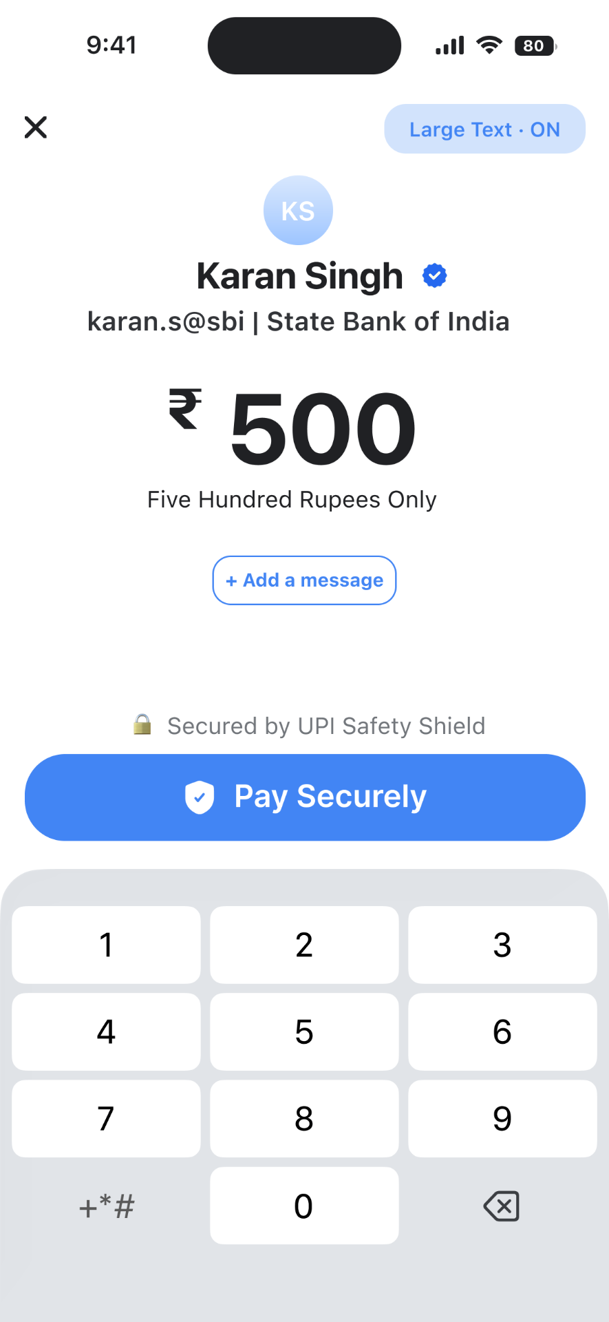
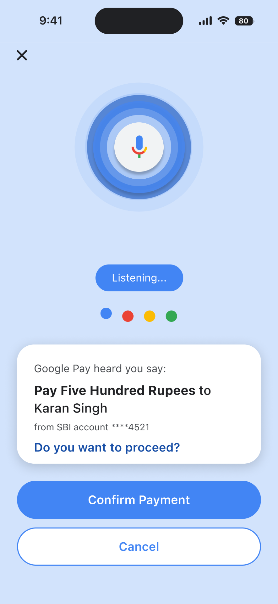
- ✓Confirmation you can see and hear: voice, large text mode and safety messages
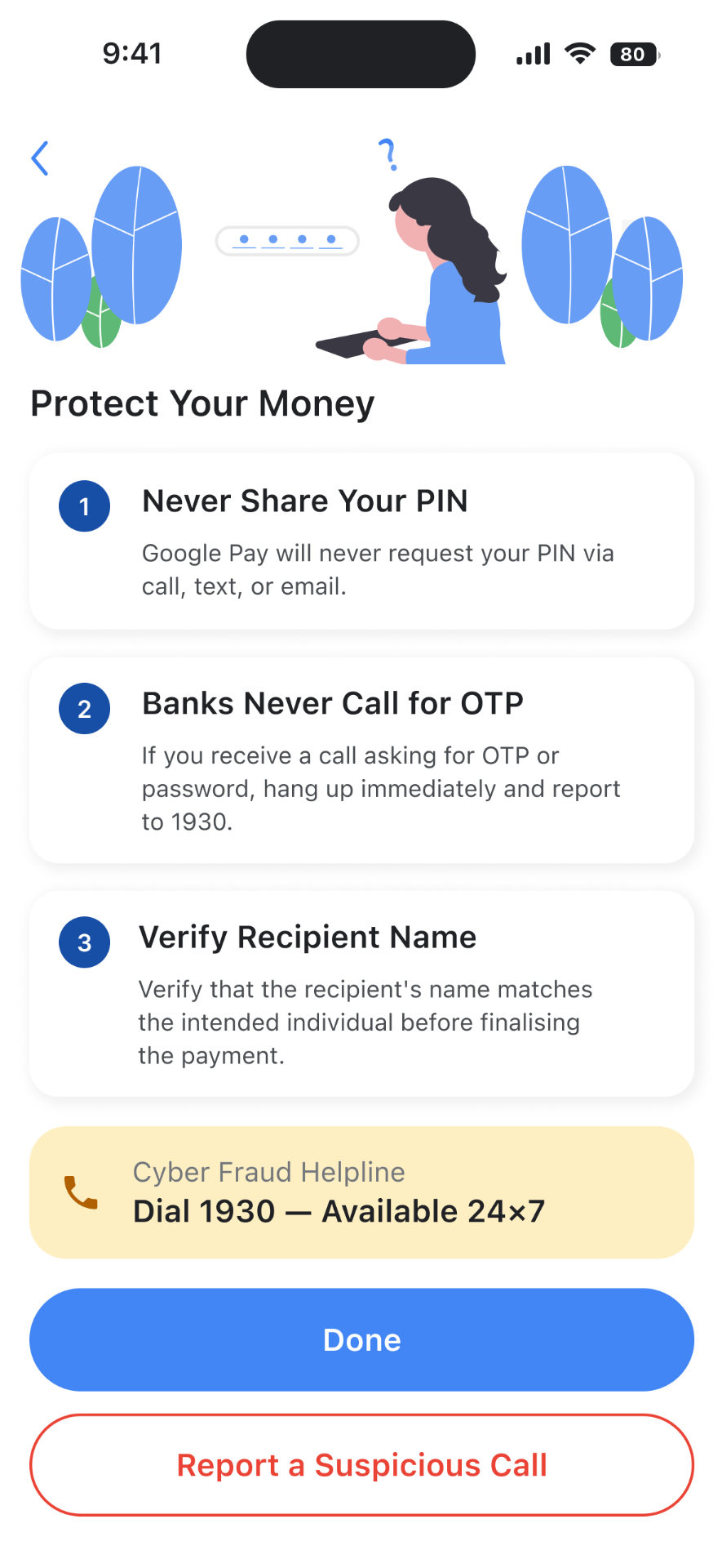
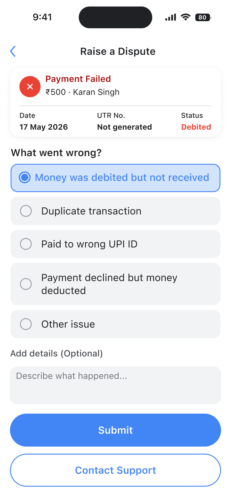
- ✓Forgiving recovery paths for fraud, failed payments, refunds, and disputes
The Problem
Paying is easy. Trusting it isn’t.
Every day, millions of people use digital payments. But for first-time or anxious users, the app can feel incredibly stressful. Tiny text, fast animations, and confusing confirmation screens don't offer much comfort. Without a clear way to undo a mistake, users are left with a constant fear of sending money to the wrong person or getting scammed, with no way to get their money back.
"When the checkout line is busy, I get so anxious that I'm going to accidentally type the wrong number or send the money to the wrong person."
A recurring anxiety from the users this project designs for
The Approach
Building trust into every tap
As the Lead UI/UX Designer, I managed this project from start to finish. I took it all the way from initial research and information architecture through to interaction design and visual prototyping. Everything I built was guided by two core ideas.
Using smart friction to protect users
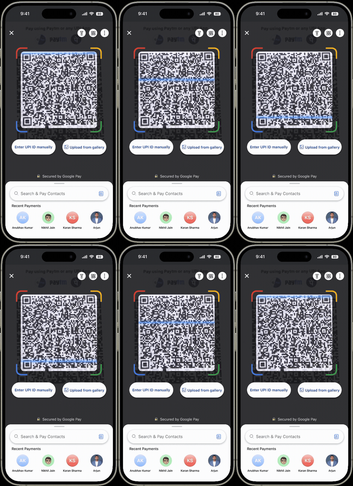
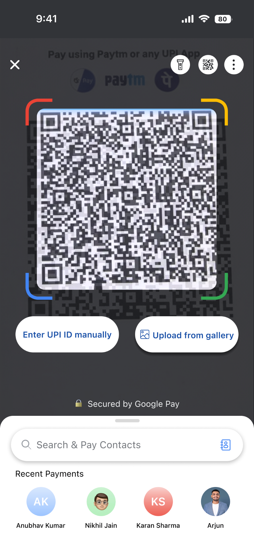
While scanning an unverified QR code, the app intentionally slow them down with amber risk alerts. This stops people from accidentally falling into a scam on impulse. By adding a deliberate speed bump right where it matters, I turned friction into a security feature instead of an annoyance.
Cleaning up the noise
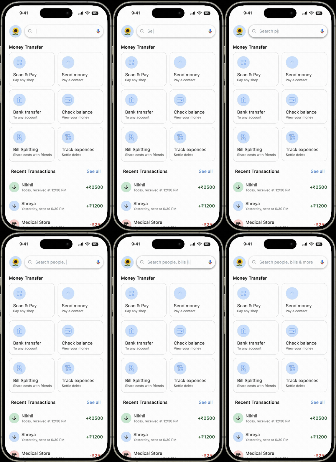
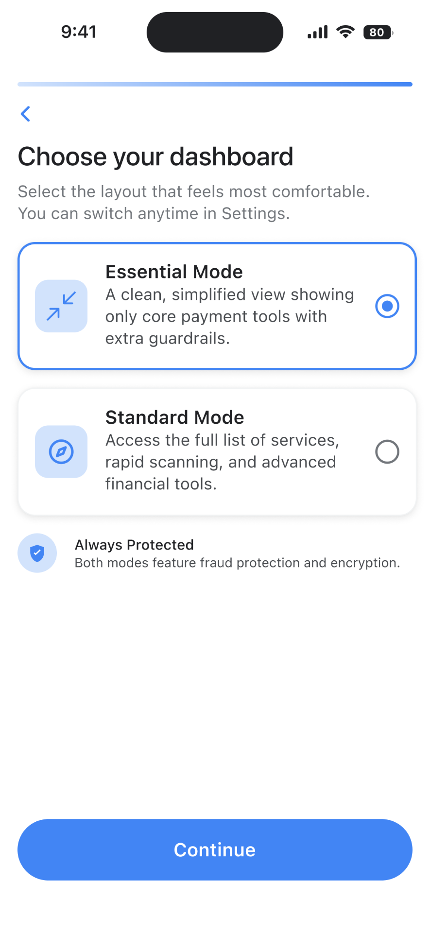
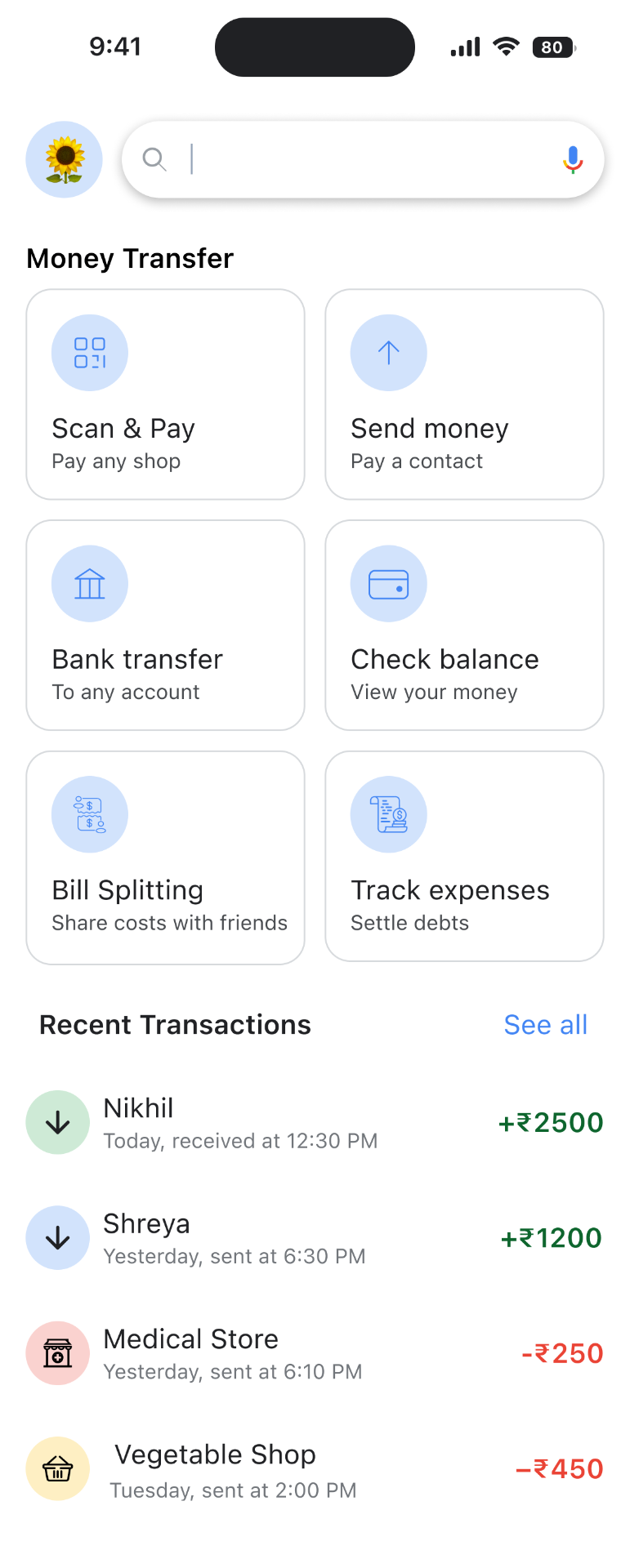
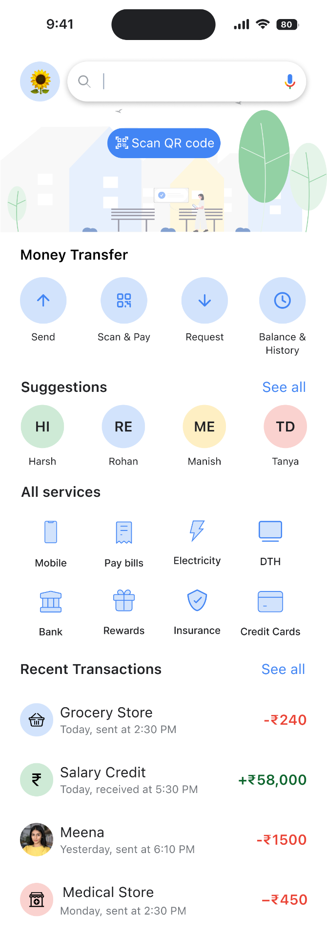
Instead of forcing a complex layout on everyone, I designed a simple dashboard selector. Users who feel overwhelmed by busy apps can choose "Essential Mode." This instantly clears out the extra financial noise and focuses purely on basic payment tools with extra guardrails, making daily transactions feel completely stress-free.
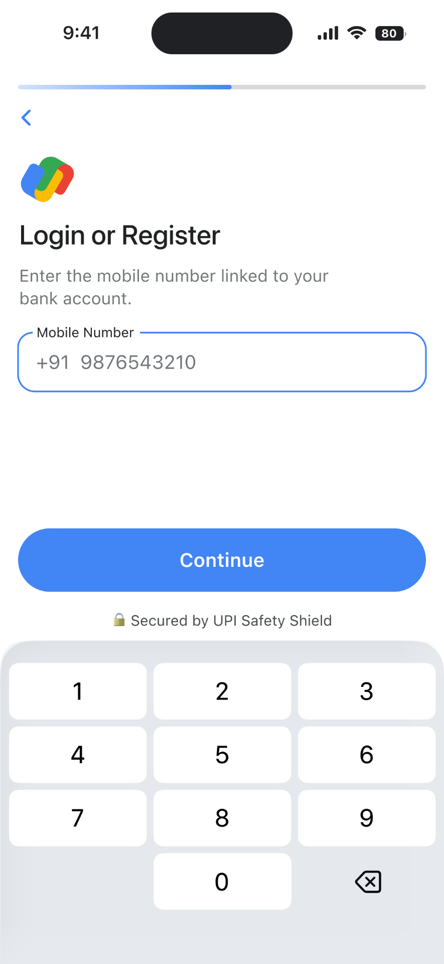
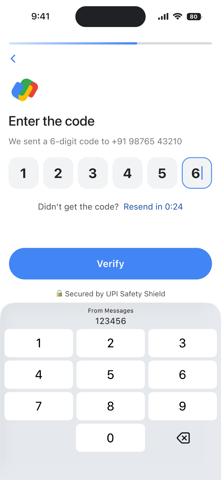
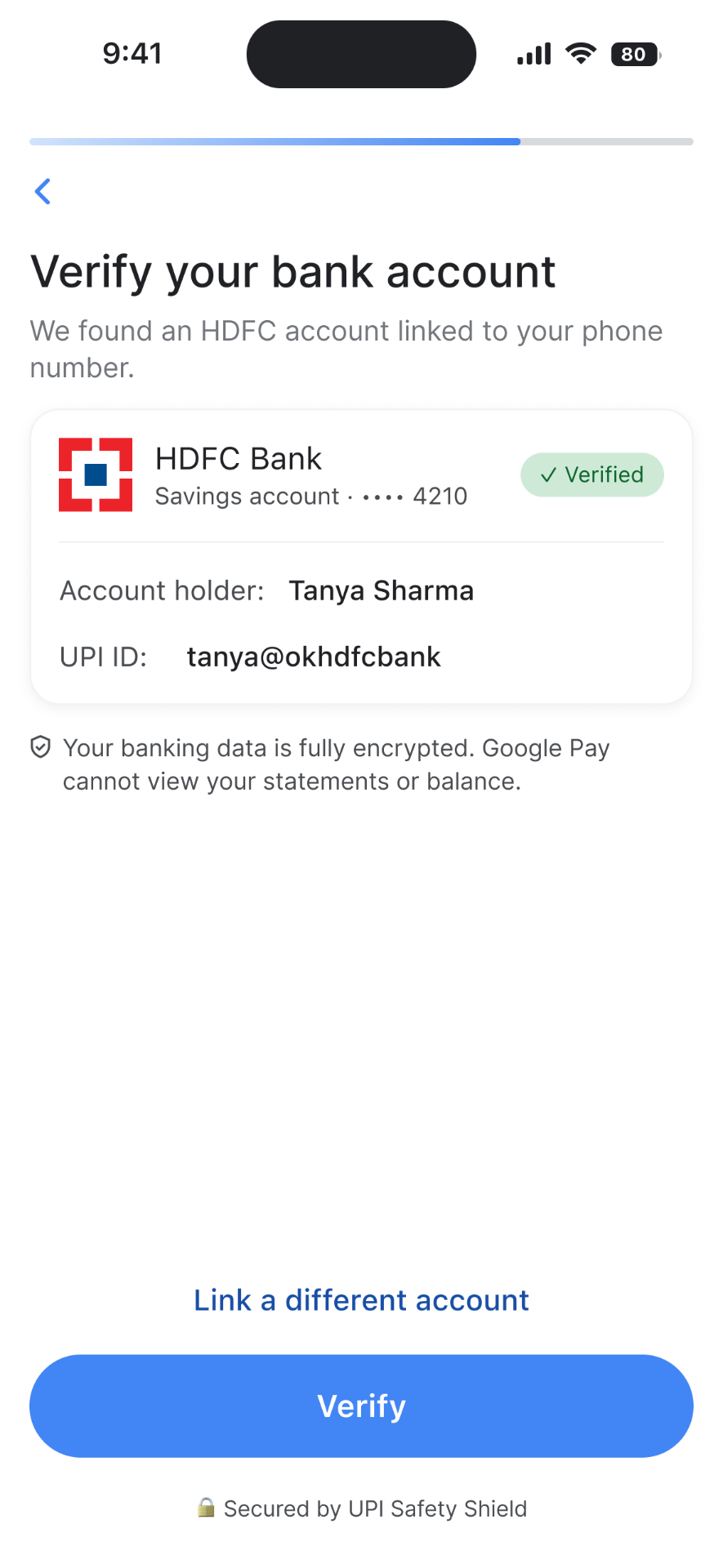
Setting up with confidence
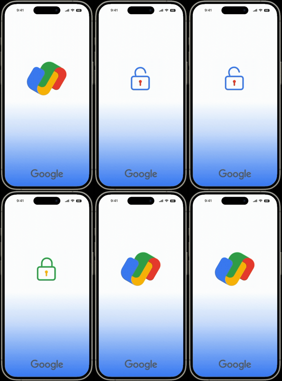
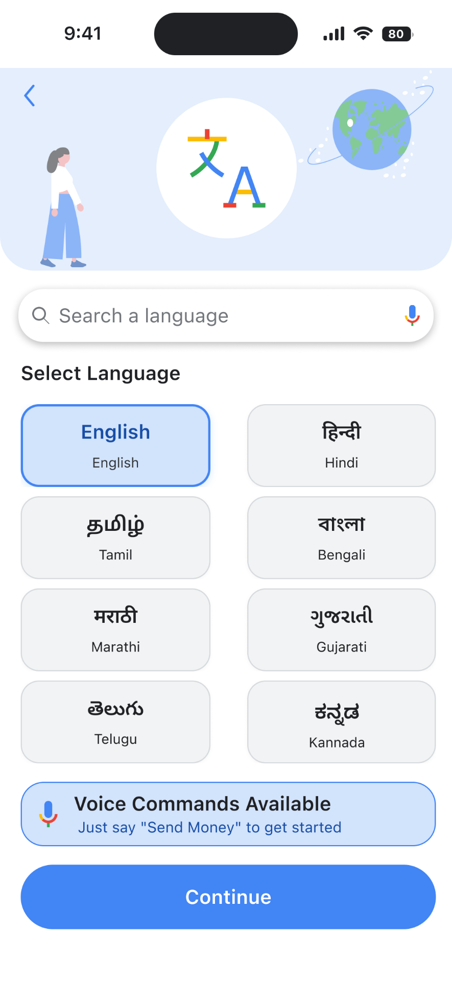
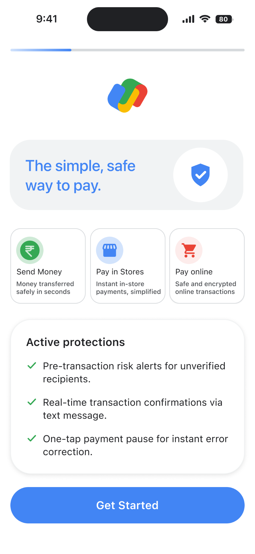
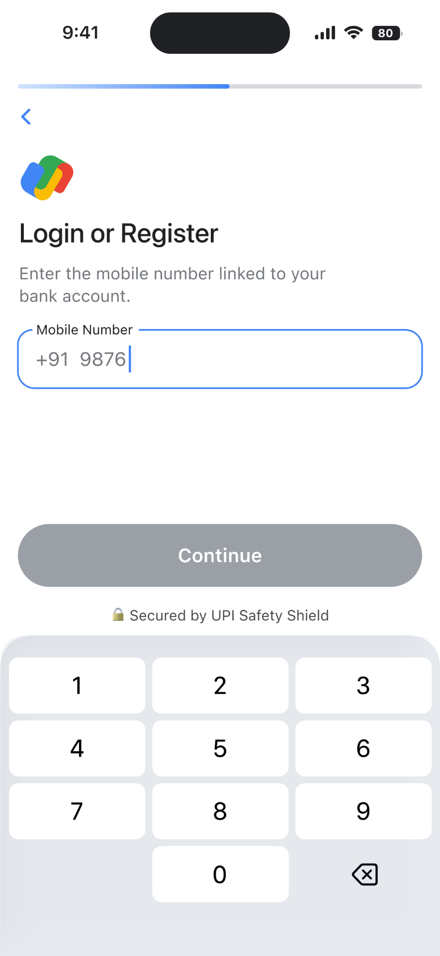
A calm, one-step-at-a-time onboarding flow that explains every security guardrail in on your chosen language before asking for any personal info.

Navigating the core spaces
A simple dashboard selector with two layout options: Essential and Standard. So the first-time users aren't overwhelmed by services they don't need yet.
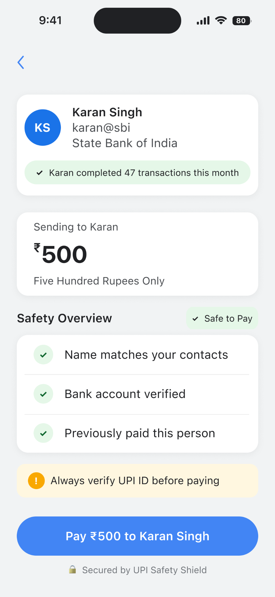
Designing for certainty
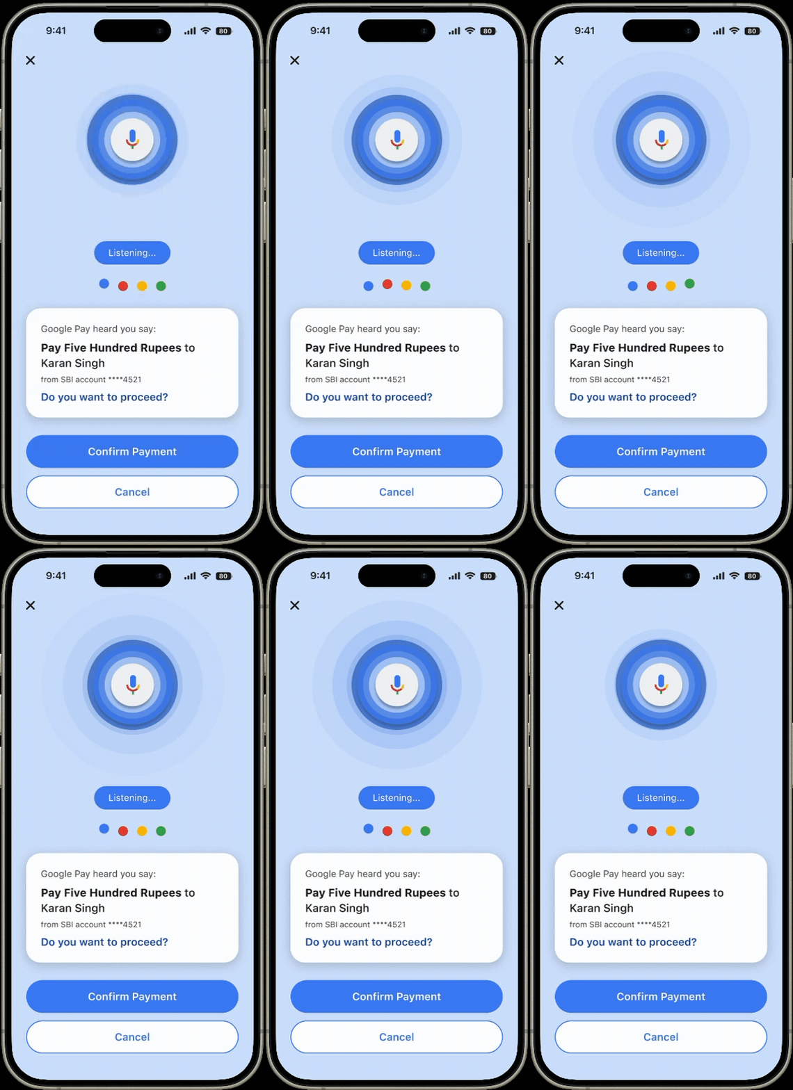
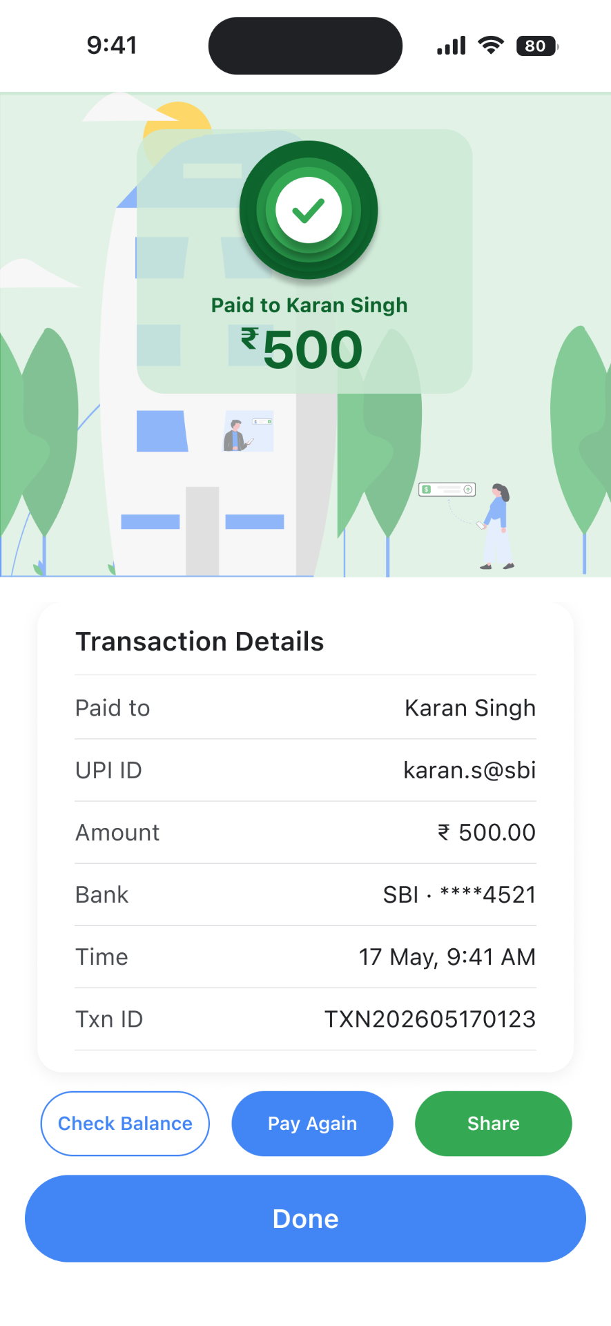
Every payment screen answers the user's biggest silent question "Is this safe?" by using clear recipient safety cards, large-text mode, and instant voice confirmation.
The safety net
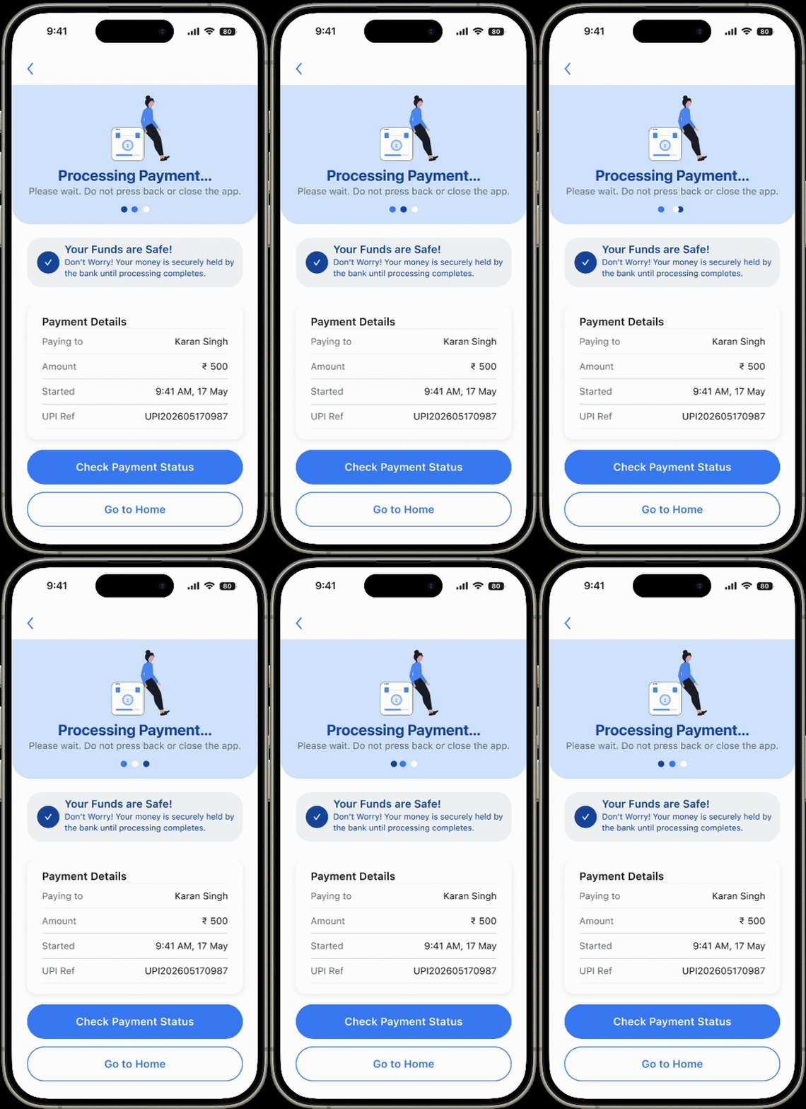
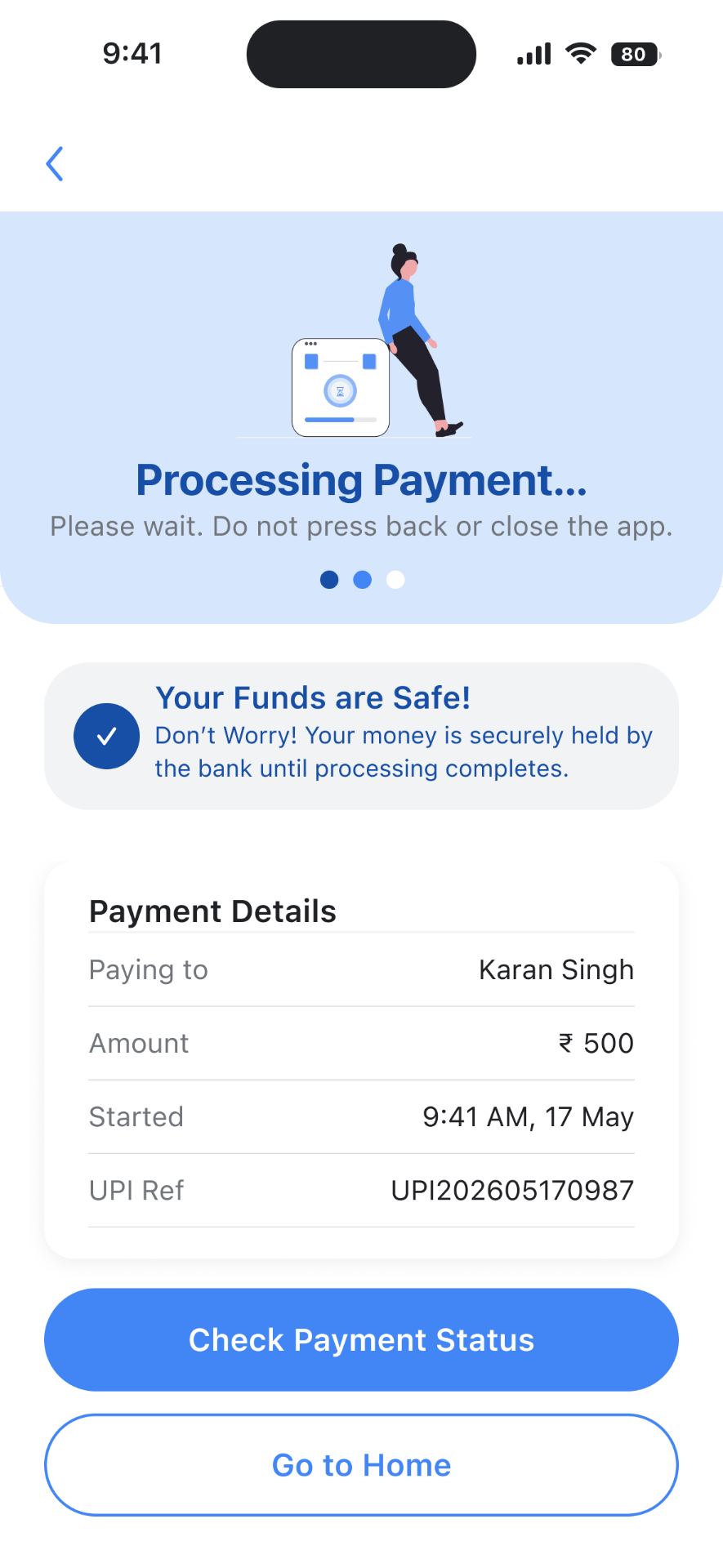
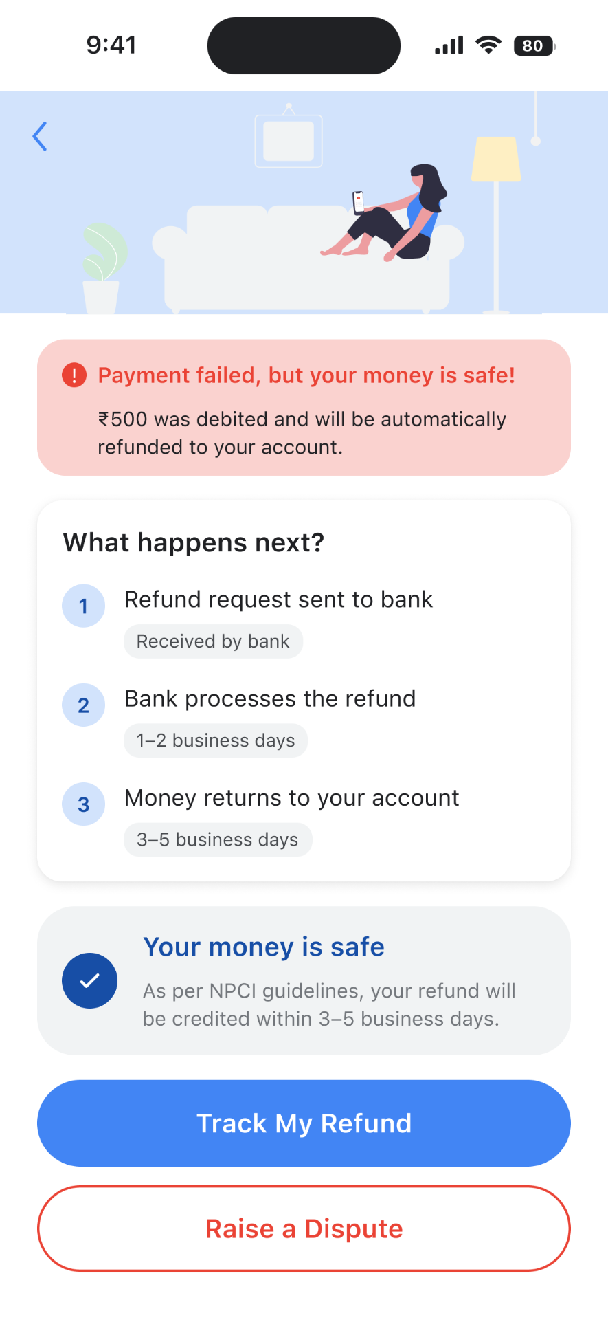
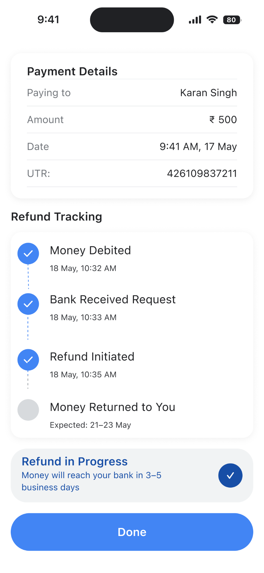
When payments fail, the app immediately cuts the panic by showing users that their money is safe, what happens next, and exactly how to get help.
Takeaways
Strip the clutter for the least confident user, and the experience gets better for everyone.
Impact
Inclusive design framework
A high-clarity UX pattern designed specifically for low-confidence and low-literacy users, the group of users that most payment apps leave behind.
User-centric fraud prevention
A system that uses smart friction to stop real-world UPI scams before they happen, without frustrating the user.
What I learned
Inclusive design benefits all
Reducing clutter for low-confidence users made the whole experience cleaner and more intuitive for everyone, not just the everyday users.
Designing for anxiety
I learned to find the high-stress moments in a journey and answer each one with instant clarity and peace of mind.
Next project
Terrago Partner Hub
Let's build something
people actually trust.
Open to product & UX design roles. Also happy to just chat, about design, photography, or whatever you're building.
© 2026 Tanvi Echpilani
I'm great at Sudoku
Product & UX Designer